think tank training centre
AI for speed, judgment for direction
Confident output, careful review: lessons from directing Claude on a quick home page redesign.

information architecture, usability testing, public sector
the challenge
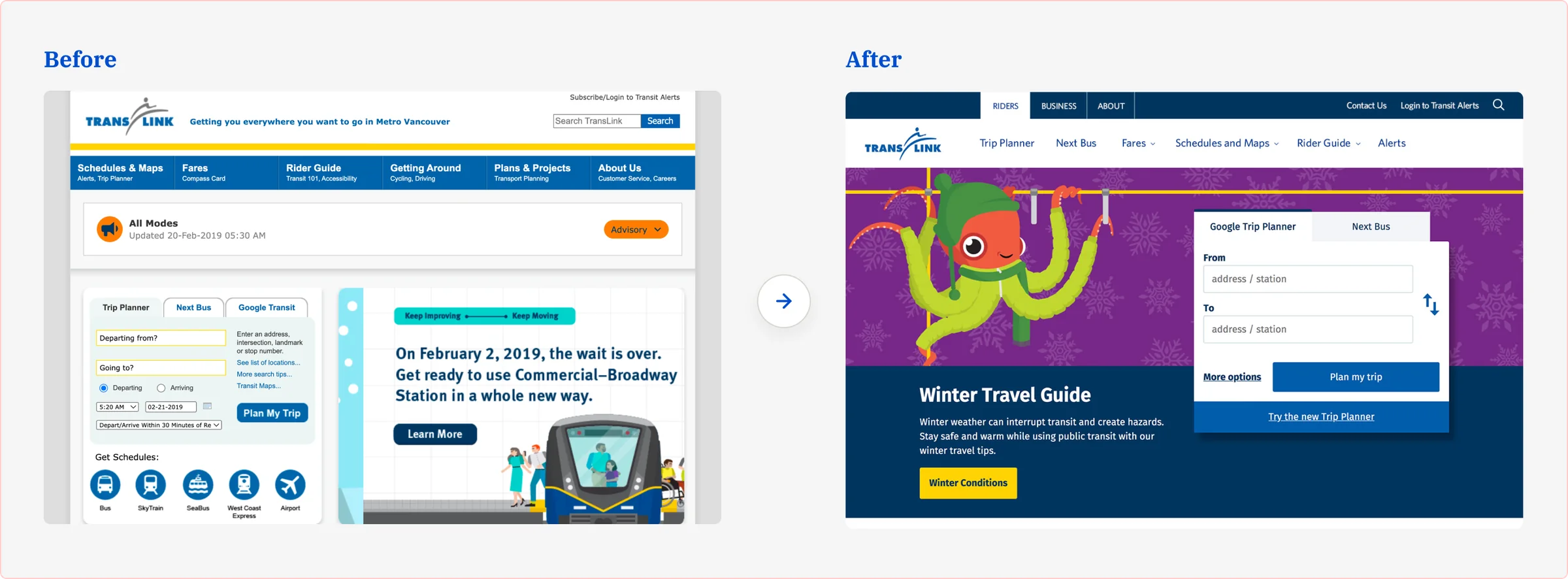
TransLink.ca had two jobs pulling against each other. For riders, it needed to be a fast utility: plan a trip, check the next bus, sort out fares. But as a public agency, TransLink also had to be findable and accountable to everyone else: job seekers, taxpayers, journalists, researchers and businesses bidding on work. All of that corporate content (careers, projects, governance, reports, and over 1,000 PDFs) sat in the same navigation as the rider tools. Riders had to step around it, and everyone else had to dig for it.
A new mobile-first rider site and trip planner were already underway, so TransLink brought in Habanero to answer the open question: where should everything else live?
How might we give TransLink's non-rider audiences a clear, findable home for corporate content, without getting in the way of riders?
my role
I ran every part of the project at Habanero: gathering and analyzing data, building interactive prototypes, running usability testing and engaging with the stakeholders.
The process
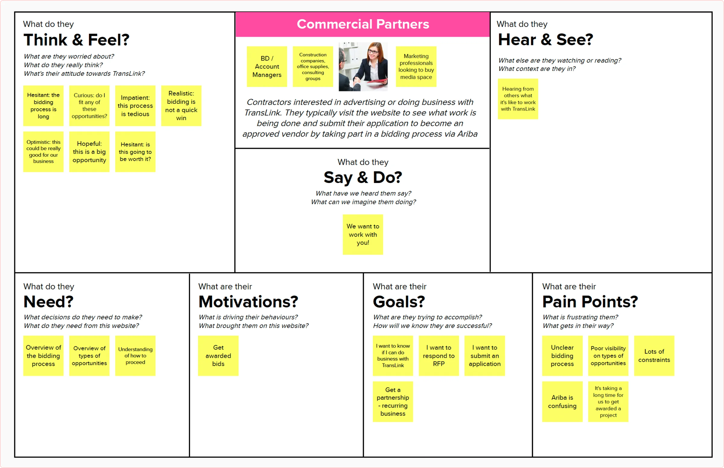
I led a workshop with the TransLink team to map the needs of audiences beyond riders, then validated those assumptions with user interviews.
I ran an open card sort in Optimal Sort with 19 participants and 60 cards drawn from the existing sitemap, to identify information themes and explore label options. I clustered the largest and smallest groupings to surface the strongest themes.
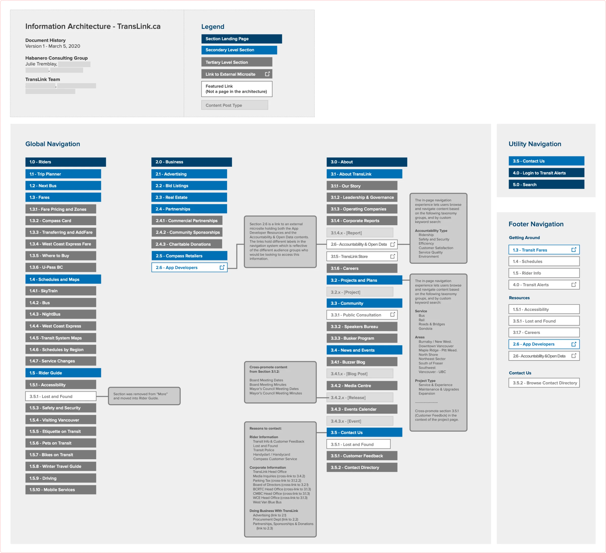
I reorganized the sitemap around the emerging themes and built two navigation concepts to test against each other: a “mega menu” that expanded on hover, and a tabbed "super nav" across three main content groups.
I tested both prototypes on desktop and mobile with 11 external participants in 45 to 60 minute moderated remote sessions, plus a simplified internal round with 8 TransLink employees. Task scenarios came from the audience research and from the cards people struggled to place in the card sort. I iterated the winning design through 7 versions.
I shipped optimized interactive prototypes for desktop and mobile, plus full IA and sitemap documentation with implementation recommendations.
The judgment call
The research didn't point to one obvious answer. Stakeholders wanted riders front and centre, but they also wanted an easy path from rider content to corporate content. The comparative research favoured dropdowns for quick visibility. And the card sort turned up six big themes that could work tucked behind a single menu or split out by audience. Instead of picking a direction on instinct, I built both: a mega menu that kept everything corporate under "More," and a tabbed super nav that split the site into Riders, Business and About.
Head to head, the usability numbers were close. A was slightly better on errors and ease ratings, and B was a bit faster. The real difference was in how people understood the structure. Testers said B's hierarchy was clearer and that it kept irrelevant content out of riders' way, and 12 of 19 people preferred it. So I moved forward with B and spent the remaining rounds refining it, through seven versions on desktop and mobile.
The outcome
Six years later, translink.ca still runs on that tabbed structure, with Rider Info, Plans & Projects and About as top-level tabs above the rider navigation. The engagement also strengthened the relationship between TransLink and Habanero.
think tank training centre
Confident output, careful review: lessons from directing Claude on a quick home page redesign.
think tank training centre
One platform for campus and online, built to scale beyond one school.
AutoTrader.ca
Workflow-first design: how one design system brought five disconnected surfaces together.
RED ACADEMY
How a full-time program, delivered in the evening, got international students into a co-op placement in Vancouver.